Leaders & Laggards
"If you buy the best performer in the group, and your timing is right, you have a crack at real price appreciation. But if you buy a stock that hasn’t moved much, or that has even fallen to a price that makes it seem like a bargain and therefore safer, chances are that you’ve picked a stock with little potential. There’s a reason, after all, that it’s at the bottom of the pile."
William O’Neil on relative performance
Relative Performance has often been considered the closest thing to a "Holy Grail" by investment professionals. The HedgeDash 'Leaders & Laggards' Ranking System allows you to quickly view the best and worst performing assets in each class on a relative basis.
The Performance Wheel
 Next to each asset you will see a coloured wheel (Green or Red) that contains a number from 0 to 100. This is known as the Performance Wheel.
The Performance Wheel is the primary gauge of strength & weakness in the HedgeDash platform and is the Asset Selection part of the Hedgedash interface
There are 3 key components that constitute the Performance Wheel: Performance Score (Relative Structural Trend Strength), Performance Wheel Colour, & Momentum Arrow.
Performance Score (Relative Structural Trend Strength)
In the centre of the Performance Wheel you will see a number between 0 and 100. Each asset is given an internal score by the Hedgedash algorithm based on a proprietary scoring system. The Performance Wheel then indicates the percentage of other assets within that class which the symbol is outperforming (green wheel) in the internal Hedgedash scoring system, or underperforming (red wheel).
Symbols with a score above 50 and Green, or above 50 and Red, are considered to be “In-Play” as they are scoring higher or lower than 50% of all other assets within the asset class
Performance Wheel Colour
Surrounding the Performance Score you will see the outer Wheel. This Wheel will fill either green to signify 'outperforming / bullish' or red to signify underperforming.
When used in combination with the Performance Score, The Performance Wheel Colour will indicate the Percentage of other assets within the class that the symbol in question is outperforming (long / bullish bias) or underperforming (short / bearish bias) in the proprietary Hedgedash scoring system
Momentum Arrow
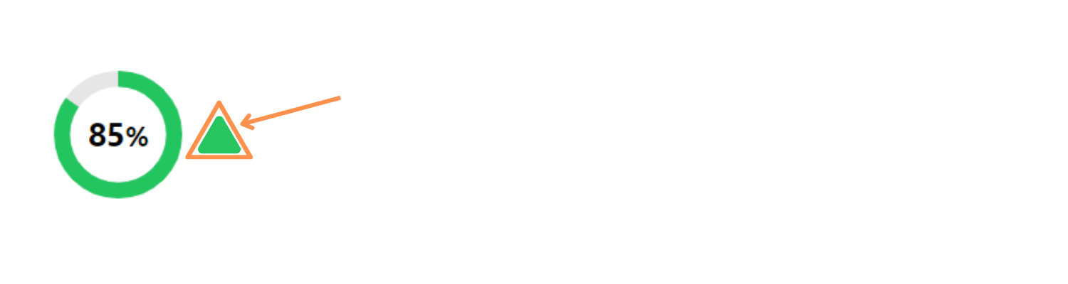
Sat directly to the right of the Performance Wheel you will see either a red or green “momentum arrow”. This arrow indicates whether the Performance Score is trending in an upward or downward trajectory.
Statistically speaking, assets that have a momentum arrow that is contradictory to their Performance scores tend to be about to structurally pause or reverse. ie, if an asset has a strong green score (outperforming) but a red down arrow next to it, this indicates that although the score is strong, it is beginning to decline and the underlying asset price is likely to decline with it.
Performance Wheel Examples
1 Strong and getting Stronger
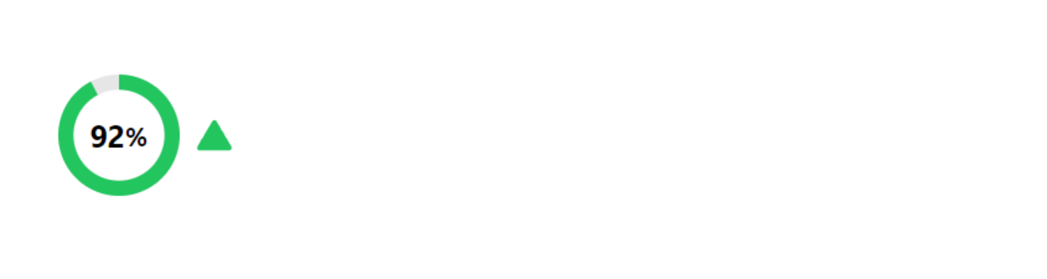 In this example we can see that the asset has a score 92% of and a green outer dial. This indicates it is structurally outperforming 92% of all other assets in the asset class. It also has a green arrow to the right of it, indicating that the score is on an upward trajectory with the number of assets it is outperforming increasing.
2 Strong and getting Weaker
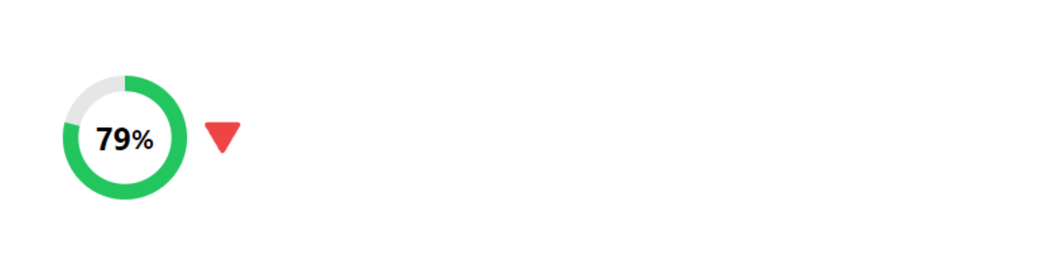 In this example we can see that has a score of 79% and a green outer dial. This indicates it is structurally outperforming 79% of all other assets in the asset class. It also has a red arrow to the right of it, indicating that the score is on a downward trajectory since it has now started underperforming a significant amount of other assets in the asset class
3 Weak and getting Weaker
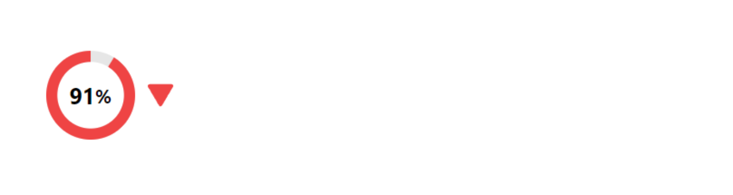 In this example we can see that has a score of 91% and a red outer dial. This indicates it is structurally underperforming 91% of all other assets in the asset class. It also has a red arrow to the right of it, indicating that the score is on a downward trajectory with the number of assets it is underperforming increasing.
4 Weak and getting Stronger
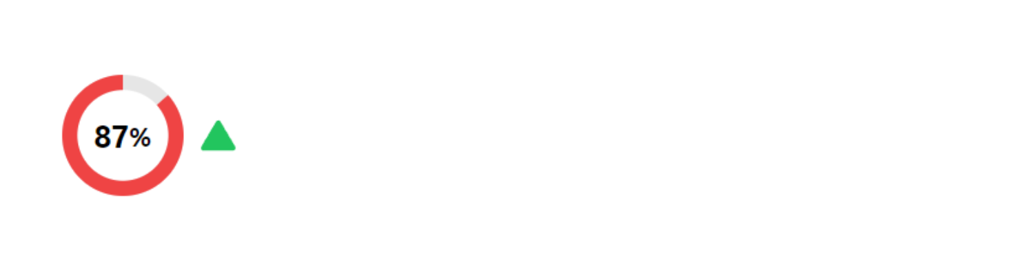 In this example we can see that has a score of 87% and a red outer dial. This indicates it is structurally underperforming 87% of all other assets in the asset class . It also has a green arrow to the right of it, indicating that the score is on an upward trajectory since it has now started outperforming a significant amount of other assets in the asset class
If an asset has a strong green wheel (outperforming) and a green up arrow next to it, this indicates that not only is the score is strong, but it is also getting stronger.
Ranking System
The Hedgedash Ranking System is an intuitive way of finding the assets which are Strong and Getting Stronger or Weak and Getting Weaker.
The Ranking system is the default sorting view when landing on the Multi Asset Expanded List view and ranks assets, in each asset class, based on their Performance Wheel and Momentum Arrows.
Strongest Ranked Assets have:
A Green Performance Wheel + A Green Momentum Arrow
Weakest Ranked Assets have:
A Red Performance Wheel + a Red Momentum Arrow
If two assets have the same colour Performance Wheel & Momentum Arrow, the Rank will be determined by the two assets Performance Wheel percentage.
Example:
Asset A – 92% Green – Green Momentum Arrow (Rank 1)
Asset B – 71% Green – Green Momentum Arrow (Rank 2)